A chromophobic impulse is a fear of corruption or contamination through color. Many weavers who begin to design their own works often feel intimidated by the use of color in their work. The imminent fear of choosing the wrong colors acts as a deterrent from exploring different color combinations.
This blog post is not going to explain to you how to get over this fear. I often fall back on the same color combinations that I always do. But I can tell you how take baby steps into exploring color variations in my work.
My favorite things to weave have very subtle color variations, often monochromatic. This means that the structure of the weaving has to be able to support the color and not detract from it. I love to use ombré color striping in my work because of the way it draws the eyes through the fabric. Sometimes I use this technique to break up a color that I don’t instantly like but I am interested in using.
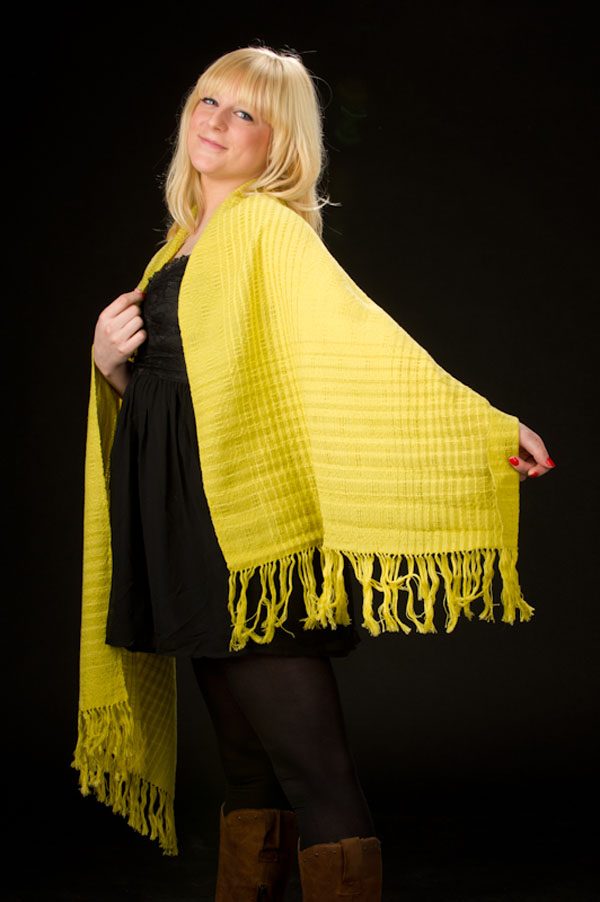
For example, I do not like the color yellow. There is just something about the color yellow that just doesn’t make me feel comfortable. The sense of anxiety and urgency doesn’t sit well with me. I do know that other people LOVE the color yellow. To them it brings joy, sunshine and other happy thoughts to mind. So how did I learn to use yellow? I incorporated two shades of green within the color family. The cool tones in the green helped to cut the acidic nature of yellow. It was a pleasure to work with in this way and by utilizing ombré striping it brought more life to the weaving. I used a Swedish lace pattern that brought dimension to the fabric without breaking the color flow.

I also have a pretty crazy habit of wanting to put together lime green and purple. This is an unexplained love affair of these two colors (I once had my Dad paint my bike neon green, fluorescent purple and black… needless to say it was my favorite bike ever.) This color combination may be awesome to me, but other people may be turned off by the abrupt color combination. That is when you begin to use ratios of color.
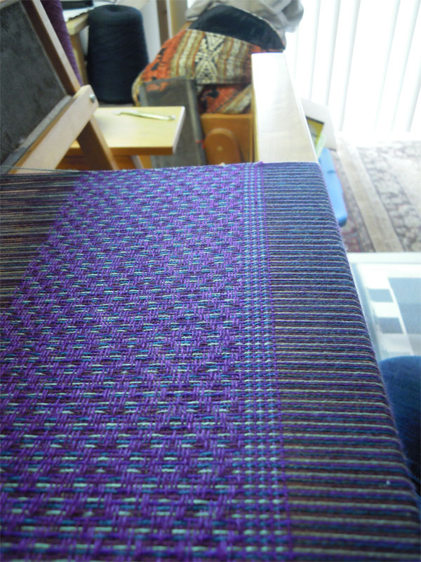
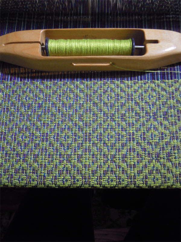
When combining threads to make a multi-colored warp, I used a little bit of the lime green, a deep blue with a green undertones, a purple with blue undertones and another purple with red undertones. This gave a pop of the contrasting color while supporting it with a homogenous color base. This warp proved to be challenging because the purple I used in the weft proved to be close in relation to the purple in the warp so it was difficult to see the pattern. The second scarf off of this weaving I used the same green weft and it just POPPED! That little bit of green in the warp helped to connect to the weft without drowning it.


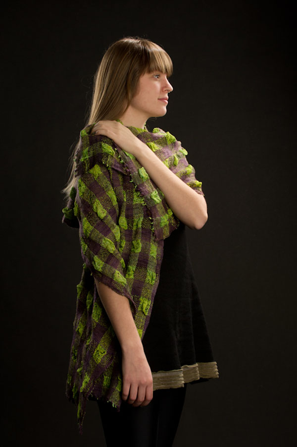
This is a similar concept I like to use in dying. This summer I will be exploring more woven shibori and hand painting warps, so I won’t go into much detail about playing with color in the dye. I will show the weaving that I dyed both the warp and weft for, which I connected the two colors with a tiny bit of yellow in both the purple and the lime green. It was a connecting factor that seemed to make the shawlette have more depth of color.

Right now I am working on color ways for the homogenous ombré infinity scarves. It makes me think on how to transition the colors together smoothly and how the weft color will effect the overall look and feel of the fabric. I am in the cool series and next I will be working on the warm series. It is my way of exercising my color without feeling like I’m going to ruin my weaving.
Are you chromophobic? Or do you have a secret love affair with colors? Is there a color that you have just been dying to weave with but you don’t know what other colors would go with it? Are you tired of using traditional colors in your work and you want to explore? I am, for some reason, itching to explore shades of rust and indigo.
I would love to hear what you thoughts about color. Feel free to leave it in the comments below or to send me a message!
Mariëtte Groos